Today we added the nearby statistics section to each property detail page on TopHap! This new section features a collection of cards that help you compare the characteristics of the selected property against all the other homes in a block, neighborhood, city, or any other geo zone.
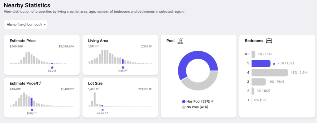
Inside nearby statistics, you’ll find 3 different kinds of charts and a zone selector.
1. Metric Distributions
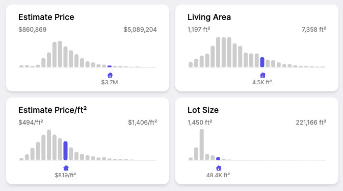
These charts show the distribution of all properties in the selected zone. Each bar is a bucket, or range of values for the given metric. The height of each bar represents the number of properties that fit within that range.
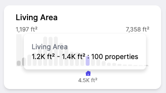
For example, if we hover over the first bucket in the living area metric distribution, we can see that in our selected zone, there are 100 properties between 1200 ft² and 1400 ft².
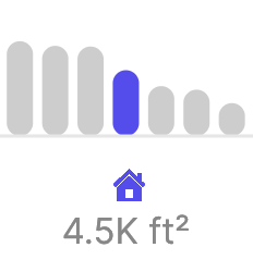
The purple bar with a house icon indicates which bucket the currently selected property belongs to. It also displays the exact value of that metric for the property. In this case, the selected property is 4,500 ft².
Interpreting the graph
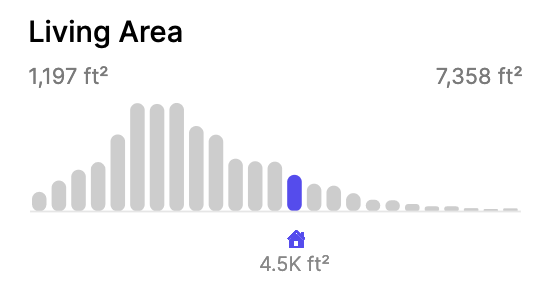
The power of these distributions comes from the shape of the curve that the buckets make. Looking at this graph, you can tell the selected property is quite a bit larger than the average home in the neighborhood. It looks to be in the top 20%. When you combine insights like these across all metrics (like lot size, estimate price, etc) you can get a unique picture of every property, and its relationship to the other homes in the area.
2. Donut Charts
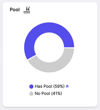
The donut chart is used to show the proportion of homes that either have or don’t have a specific feature. Just like for the metric distributions, this gives us an idea of how common or uncommon a feature is in a given area.
In the example above, we can see that the target property has a pool, just like the majority of homes in the neighborhood. Hover over a segment to see the exact number of properties in each bucket.
This widget is extremely useful for identifying specific features that are common for the area but missing for your home. Alternatively, it can also help you identify special features that your home has that other homes in the area don’t typically have.
3. Categorical Distributions
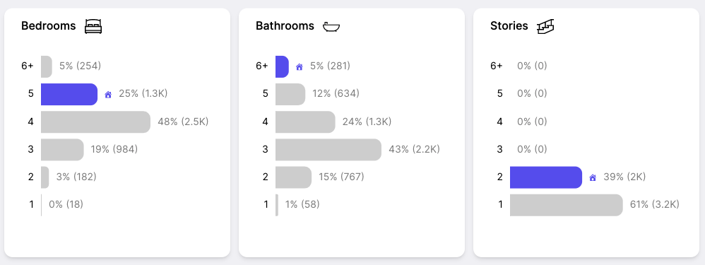
These bar charts are used for metrics that have discrete groupings, rather than a range of values like the metric distributions above. Like the other two widgets, these are helpful for understanding how your target property compares with others in the area. In this case, for important facts like bedroom, bathroom, and story count.
In the example above, we can see that this house has more bedrooms and bathrooms than average in the neighborhood. You can also tell that while 5 bedrooms is uncommon in the area, having 6 bathrooms is a far more unique feature, since only 5% of homes in the neighborhood have 6 or more bathrooms.
Zone Selector
The last part of the new nearby statistics section you should be aware of is the zone selector.
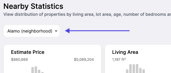
When you select the drop down, you’ll get a list of all of the zones that contain the currently selected property. Here’s a sample of the options you could expect:
| Local Area (1km) |
| Stone Valley Oaks (neighborhood) |
| 3 (block) |
| 3461.02 (tract) |
| Alamo (neighborhood) |
| Alamo (city) |
| 94507 (zip) |
| Green Valley Elementary (school) |
| Los Ceros Middle School (school) |
| Monte Vista High School (school) |
| San Ramon Valley Unified School District (school-district) |
| Contra Costa County (county) |
| California (state) |
When you choose a different zone, the distributions are recalculated on the fly and update to show you data for the new area. With the click of a button, you can now compare how a property stacks up to the other homes in it’s block, tract, neighborhood, city, zip, county, state, or even school district.
It’s fascinating to see for example that your target property is extremely expensive for the county, but not for the neighborhood. This would suggest that the selected home is in one of the nicer neighborhoods in the county.
These examples only scratch the surface of the insights you can gather with TopHap, but hopefully they have demonstrated how powerful the new nearby statistics section can be for understanding the contextual information around what makes this particular property unique or similar to other properties around it.
Visit any property detail page on TopHap to try nearby statistics today!